
There’s an online RETAIL needlework show coming up very soon, November 5-8. You’ve seen our announcements in the past about the wholesale show, but this one is retail, meaning individual stitchers can shop this show. Here’s the announcement. Note: LNS = local needlework shop, ONS = online needlework shop.
We’re trying something new next week…we’re offering you a RETAIL show online! The show will open at 2pm EDT on November 5th and close at midnight on November 8th. The “location” for the show is:
We realize that many consumers don’t have an LNS or ONS that they regularly use, so sometimes, trying to order products shown during a wholesale show can be a bit awkward. Even if you have an LNS, perhaps the store owner can’t order for you due to minimums and shipping in the wholesale show.
Now, you’ll have the opportunity to place your orders directly with exhibitors! Better yet, since it’s a retail show, many shop owners are participating, too! If you don’t already have “your” LNS, it’s a great opportunity to find one.
Plus, you never know what “goodies” other stores will be offering, so you can go on a virtual shopping spree.
We hope to make this a yearly event, but that’s UP TO YOU! If you like the idea of a retail show, let the exhibitors know, even if you don’t place an order with them this time. Send them feedback about the products they’re offering or let them know what you’d like to see next time.
So mark your calenders… Nov 5th-8th at http://needleshowretail.com
Scarlet Quince will be advertising in the show, although we’re not selling through the show (but as always you can shop through our website). We’re going to have drawings for doorprizes so be sure to visit!

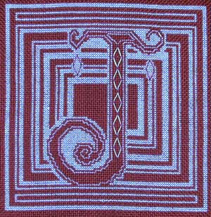
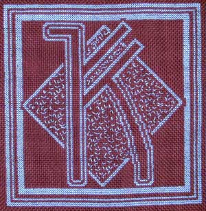

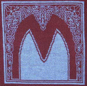
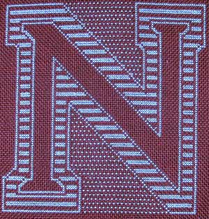
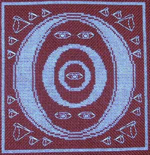

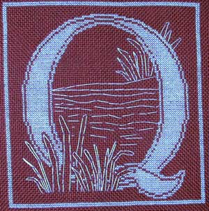
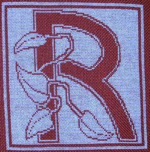 R took almost a month, and no wonder. I like it though — it reminds me of filet crochet (which I can’t do). I’m currently about half-way through S which is another mostly solid letter. There’s a little too much of that if you ask me, although in a way they’re easier than the ones with more blank spaces (less counting).
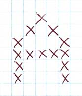 I decided to do it in harganger. I have stitched hardanger before, following a pattern in a leafletI had, but I have never tried to design hardanger. It’s kind of mind-blowing because the basic units (Kloster blocks) are 5 stitches wide with each stitch covering 4 threads (which is 5 holes), and you arrange them corner to corner so you get squares. The pattern I worked before had each stitch laboriously drawn on graph paper showing exactly where each thread goes. I tried to do that but kept messing up. Finally I decided it would be better not to think too hard about it. I started by designing simple letters in a grid 6 x 5. Here’s my A.
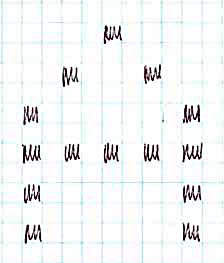 The “pixels” in the letters are going to be the open places after cutting threads, so I moved them apart to allow for the stitching around them:
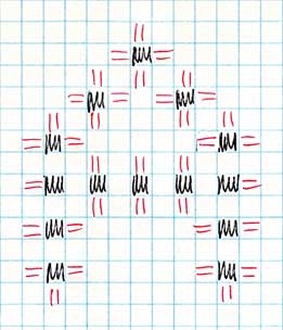 Then I sketched in my Kloster blocks around them. (Represented by the red lines — just pretend there are 5 instead of 2.)
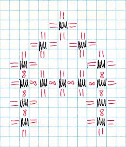 The remaining spaces between the places that will be cut out have to be needleweaving, indicated by 8′s. If you haven’t done hardanger, trust me: they just do.
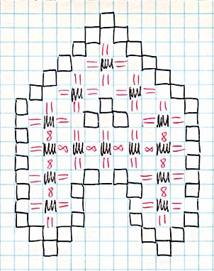 I decided I wanted a little more embellishment and was thinking of putting another row of kloster blocks all around, but decided that would look stupid and might not even work. Instead, I substituted a border of double wave stitch. This also made the letters bigger since so far the design is really pretty small.
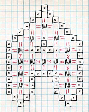 I planned to do this on some of the Ariosa Fine that is left from my redwork alphabet, since it’s 22-count. (My hardanger booklets recommend 22-count fabric with #5 and #8 pearl cotton.) The thing I forgot, though, is that it has a rayon content, which means that the cut ends get kind of fuzzy. 100% cotton or linen would be much better. I played around a bit with colors for the stitching but there aren’t too many colors that come in both sizes of thread, so I settled on red for the Kloster blocks (#5) and needleweaving (#8), and gold (#5) for the outline. Once I had made that decision, I thought gold beads would be a nice addition. I ad libbed them but here is my basic approach to the bead placement (dots on the diagram).
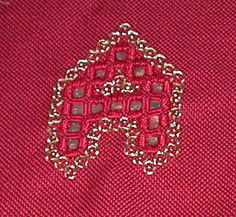 Here is the finished letter A. I backed it with gold tissue lame. (I took a finished letter to the fabric store and tried different backings. I had thought about black, but liked this better.)
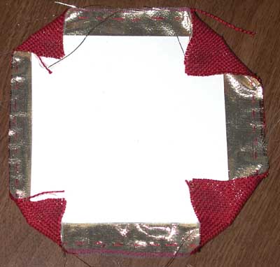 MRA kindly cut squares from mat board which is very hard and stiff and he got them all the same size, which I wouldn’t probably have managed. I glued the letters to the squares and also turned the corners in and glued them. I bought some special fabric glue while I was buying fabric — it was supposed to dry clear — alas, not so. (The red square isn’t centered on the mat board because despite much counting and measuring, the letters never came out really centered in the fabric squares I had marked.)
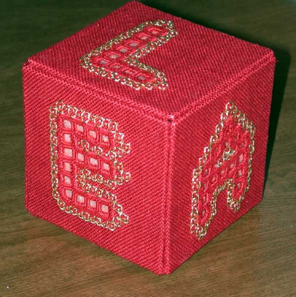



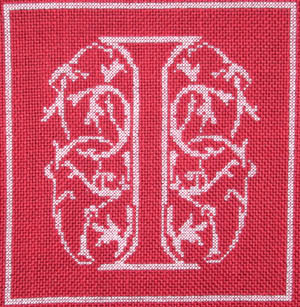 I forced myself to finish the letter I before starting another letter just to see how long it took to do this relatively small letter. It took 13 days, but that’s elapsed time, not stitching time. There was a jigsaw puzzle in there, and not much else happens when I’m working a jigsaw puzzle. (This was a Christmas tradition in my family, which I have allowed to bleed over into New Year’s. I think this is the first year I’ve had one at Thanksgiving. It’s a slippery slope. Next it will be Columbus Day, then Labor Day, Flag Day, Arbor Day…)


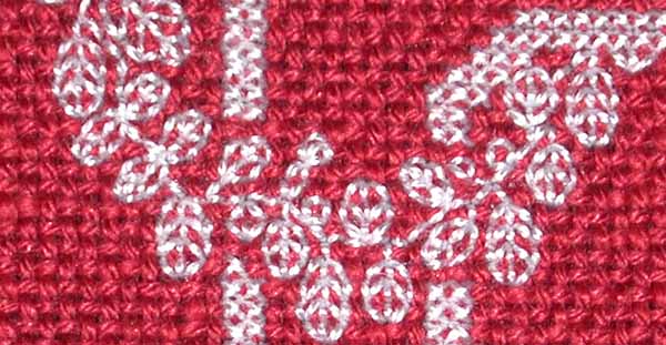
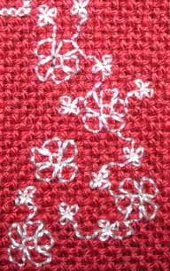 D, E, and G are finished except for the borders. The letter F itself is finished, there is just topstitching to do. Most of the vacant area to the right of the F will be filled with this stuff. Recall that this is 22-count fabric so the little leaves are REALLY tiny. I had to figure out a good order to do these little figures so that the stitches support each other instead of pulling under the threads in the fabric. Obviously there’s a lot to do on the H, but I feel very happy with my progress. I started this in late June so this is a little over 4 months and it’s a LOT of stitches.
 I am tempted to put this aside and start working on another Scarlet Quince for a while, but I can’t decide what I want to work on next. I’m leaning toward Hopper’s Mansard Roof at the moment.
 I was also thinking about “Splendid”
  or “Still Life with Fruit and Pocket Knife” but I feel like I have done enough fruit or a while. So temporarily I’m racing ahead to the letter D while I try to make up my mind. I know some people have a good system of rotating from one project to another but I suspect if I start something else, I’ll finish it before I come back to this — so maybe I should just finish this!