Cross Stitch Patterns from Fine Art by Scarlet Quince
 Cart 
 Wish list
     |     
     |     
Check out
     |     
     |     
Wholesale log in
Member services
Scarlet Quince
Goodies
Become a Member

Scarlet Quince Ramblings

Cross stitch ... art ... life

Lady with Unicorn: Sense of Eternity
Tuesday, September 23rd, 2008

I’ve been working on the next Lady with Unicorn now for, oh, forever.  Weeks.  I’m not sure if this one (it’s Sense of Touch) is in worse shape than the others or if my standards are getting higher.  You can see in this picture that there’s a large area at the bottom that is faded or stained.  There’s an area to the left of the lady which also seems abraded — maybe damage where the tapestry was folded for a long time.
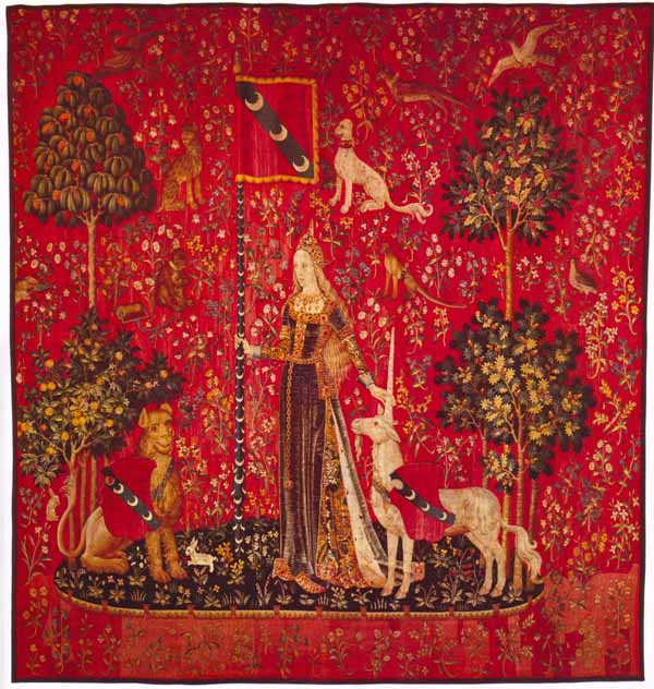
Lady with Uncorn: Sense of Touch

What you can’t see at this size is that there is just a lot of discoloration and spottiness everywhere.  The red was originally a uniform color, I’m sure, and I hope to be able to get it back to something resembling that.  It won’t be absolutely uniform — part of the tapestry look is the color variations — but on the other hand, there shouldn’t be 100 reds.  I didn’t do this for Sense of Hearing or Sense of Taste but have had something of a change in philosophy since then: to the extent possible, I think the cross stitch patterns should reflect the art as it was originally created. Obviously there can be technical problems with doing that, as well as with knowing how it once looked. But, for example, paintings have a tendency to turn yellow and/or darken with time, and fabric fades (especially greens and blues). Yellowed and faded colors can be fixed; dark colors that have turned black can’t. Once the detail disappears, it’s gone (until the original painting is cleaned).

Another thing that is odd about all these tapestries is that they’re darker at the top than the bottom (aside from the faded areas).  This may be due to problems with photographing something this large, although you would think that they would have set up good lights.

The New Yorker had an interesting article a while back about photographing the Hunt of the Unicorn tapestries at the Cloisters.  They took them down to wash and repair the backing and photographed them while they were soaking (they had made a tub big enough to soak them flat).  They photographed them in sections, thinking that the sections would be easy to tile together, but it turned out that the tapestries were creeping the whole time they were in water.  They ended up hiring a couple of mathematicians who used a supercomputer to put the pictures together.  You can read the article here.


Gas
Friday, August 29th, 2008

I finally finished the pattern of Edward Hopper’s Gas yesterday. Gas - Edward Hopper I have been working on it for several days and not getting very far. It turned out to be much more difficult than I thought it would be to create a pattern from it. Usually, it’s the pictures of people that are the hardest — getting the skin tones right and arriving at a reasonable compromise between pattern size and detail.
I kept going back and forth between two images — one had an obvious diagonal pattern from halftones in the original print, and the other, while I liked the colors better, was very “pixellated”. But the main problem was adjusting the colors to a palette that could be matched in DMC floss, was attactive, seemed realistic, and had the right feel. When I started doing this, six years ago, I usually left colors pretty much alone. But I eventually realized that a lot of paintings are very dirty, or the varnish has yellowed or fogged, or even that the scan distorted the colors, so now I take a freer hand with color. I confess to a preference for bright, strong color and finally arrived at a version of the pattern that had clear, bright colors. Only then did I realize that it no longer looked like dusk — it looked like the middle of the day and the light from the little building made no sense.

The dim, dull colors (which aren’t as pretty) are the very thing that makes it look like dusk. I suppose this is because of the way our eyes work — the cones, which detect colors, are not very sensitive to light (so they need a lot of light to work). The rods are much more sensitive to light but they don’t detect color, so we can see in the dark but as it gets dark colors fade to monochrome. This is really quite an amazing picture on a technical level. The only really bright spots are the red gas pumps which are lit up by the light from the building. Although the sky is blue, the dim greens of the pines and the dull red of the roof (which would probably be bright red at noon) convince us that it’s twilight.


Licensing woes
Wednesday, July 23rd, 2008

I mailed a letter to the Escher Foundation about three weeks ago since I can’t reach them by email or fax, and asked them to send me an email to let me know that they got the letter. So far, nothing.

Someone recently suggested several works by artist Jim Daly, who primarily paints nostalgic pictures of children playing. He has a web site which shows a bunch of pictures available for licensing but my email bounced and the fax machine doesn’t answer. I wonder if the mailing address is any good? I realize that a lot of people pay someone to set up a web site for them and then it’s never maintained again but it’s SO frustrating.

I regularly get requests for Jack Vettriano’s work (“The Singing Butler”, “Dance Me to the End of Love”) but the gallery that represents him says that he won’t license his work for cross stitch. I asked them to point my web site out to him so he could see that this is not typical cross stitch but they didn’t dignify that with an answer. I suppose if I was paying someone to see that I was not bothered, I’d like them to see that I wasn’t bothered (but then I usually leave the sound up for TV commercials in case there’s a product I’m interested in, so I don’t really see myself having someone else do my filtering for me).

Another piece we’ve been turned down on is Edvard Munch’s “The Scream”. I’m amazed at how many people have asked for that. I understand that his estate has decided that the ubiquitousness of the image is cheapening it (a little late, since it’s on everything from posters to mouse pads).

The Rene Magritte estate won’t give permission to use his works either. They are copyrighted for another 29 years so that pretty much takes care of that.

Today I emailed off for permission to use several pieces by Pablo Picasso and Henri Matisse. It doesn’t take very long to ask the question but it will probably be months before I get an answer (and I will have to follow up in a couple of weeks, if past experience is any guide, to ask the Artists Rights Society rep if she saw the previous email, and then she will ask me to send it again). And I don’t know how good the chances are of getting permission at affordable rates, either.


Suggestion with a story
Monday, July 21st, 2008

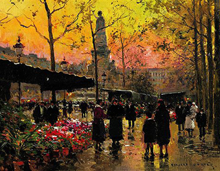
I was going through recent art suggestions this morning — I learned a long time ago to check that the titles and artists are correct — and this was one of them: The Flower Market by Edouard-Leon Cortes (or Marche aux Fleurs). You may have seen this in the news recently. Someone left it at a Goodwill in Maryland, where the staff would normally price something like this at about $100. However, they noticed that it had an old frame and a brass plaque and checked with Sotheby’s and discovered it was valuable. It later sold at auction for $40,000. Amazing. Things like that are always turning up on Antiques Roadshow — someone brings in a painting that their mother bought at a thrift store for $1 and it turns out to be by an obscure (to me) but highly collectible artist. The question is, why doesn’t it happen to me? When I go to the Blue Hanger all I see is awful trash. There’s apparently a knack (and it probably requires a lot more time at thrift stores than I want to spend).


Hummingbirds
Wednesday, July 16th, 2008

I’ve been working on a new hummingbird pattern, a detail of the Columbian hummingbird pattern (AUD002), in the ongoing quest to have more small patterns. I approached it by taking the existing pattern and removing all but one hummingbird, flower, and few leaves and a piece of stem. Much to my chagrin, that little section uses ALL the colors of the larger pattern. I did manage to reduce the colors some, but it still uses a LOT of colors for what will be (I think) our smallest pattern yet.

As I worked on the pattern, thinking about hummingbirds going after nectar, I realized that I don’t actually know how flowers produce nectar, or which ones have a lot of nectar. (The only nectar flower I’m familiar with is Japanese honeysuckle — as kids, we used to pick the flowers, pinch off the base, and suck the nectar. Yummy!) I thought hummingbirds were primarily attracted to red, tube-shaped flowers. Maybe it’s the color more than the shape — I sometimes see hummingbirds checking out our orange cannas, which they apparently find to be a big disappointment.

Right outside my window is a hummingbird feeder and a flame acanthus, which just started started to bloom. The hummingbirds have been visiting the acanthus flowers and it’s cool to see them actually put their beaks all the way into the flowers, but they always seem to decide it’s too much work and go back to the feeder. The quamoclits are starting to bloom, finally, but they apparently are not good hummingbird flowers. The flame acanthus is a native plant, so maybe that has something to do with it. Here they are, flame acanthus on the left, quamoclit on the right. Both flowers are about an inch long (2.5 cm).

Flame acanthusQuamoclit


Something in black and white
Wednesday, June 11th, 2008

I still don’t know if I have succeeded in reaching the M. C. Escher people. I sent another fax asking them to email me about whether they got the first fax or not (and if I am reaching someone other than the Escher company, to email me anyway). So far, nothing. But in the mean time, I remembered this old thing, “All is Vanity” and thought it would be a good test for a black-and-white chart.
All is Vanity
I used to see it often at flea markets and antique shops. It’s a lady looking at herself in the mirror but the overall effect is of a skull. It must have been very popular at one time but I’m not sure whether people took it as a moral comment on vanity or if they thought it was funny.

The artist drew it in 1892 when he was 19, and went on to have a fine career as an illustrator but this is his most famous work. How sad to peak at 19, or for people to think you did!


Hope for M. C. Escher
Wednesday, June 4th, 2008

I just got an email from someone at the M. C. Escher Company in the Netherlands! He had just received an email I sent about licensing Escher’s work on April 11 — 7 weeks ago! That was the latest of a series of emails I’ve been sending to various email addresses since May 17 of last year. I’ve also tried faxing but their fax machine never answers. Of course there’s always the mail and I would probably have tried that as a last resort but I presumed I was just getting the cold shoulder. It’s not unusual for one email to get lost — but 6 or 7? I often tell people that when we have to license art, it’s a time-consuming process. This is an example.

But now there is a real person at the other end and maybe we’ll be able to offer some Escher charts before too long, if we can agree on terms. Keep your fingers crossed!

I shouldn’t reproduce any Eschers here without license but there is a nice gallery on the official website.  Look on the left near the bottom for “Picture Gallery”.


Mucha
Monday, June 2nd, 2008

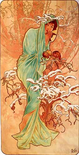
Winter - Alphonse MuchaI’m currently working on a chart of Winter, the last of Alphonse Mucha’s four seasons from 1896. (He did at least one other set of seasons.) Aside from not being very rectangular, the original I’m working from is in pretty good shape, so it’s going well.  I’m not sure, but it looks as if Mucha usually drew his borders freehand.  I can make it rectangular but sometimes I wish Mucha had used a ruler.

Mucha is best known for his Art Nouveau pieces, and recently someone wrote saying that I must have made a mistake on Heraldic Chivalry, which is nothing like the Art Nouveau pieces, and it must be by some other artist. It certainly is completely different but it really is by Mucha. Even more different are his Slavic pieces, such as  Jaroslava or The Apotheosis of the History of the Slavs, which is part of a series of 20 (20!) paintings known as the Slav Epic.  These are very serious works, or at least self-important, and I thought perhaps they were his real interest, labored over in spare moments while the Art Nouveau ads paid the bills. It turns out that he went along for years, happily dashing off beautiful women in swirling gowns, without any feeling that he was underachieving. Then he visited his home in 1900 and had some kind of epiphany. He decided he was fed up with Art Nouveau and would dedicate himself henceforward to glorifying the Slavic people. If you are a student of human nature, you won’t be surprised to hear that the Czechs didn’t appreciate this. They resented the fact that he had gone abroad to make his fame and fortune and basically regarded him as a fink.


Privacy policy | Return policy | Site map | Member services | Contact us | Help
Copyright © 2002-2024 Scarlet Quince, LLC. All rights reserved.
You are welcome to link to this page but you may not use words or pictures on another site without written permission.